Designing for Accessibility and Conversion at the Lewis Law Firm
Enhanced readability and navigation leads to reduced bounce rates, resulting in increased conversions and improved customer engagement.
COMPANY
Anonymous law firm
ROLE
Web Designer
EXPERTISE
UX / UI Design, Research
YEAR
2024

Project Goal
To identify and resolve critical usability issues on the Lewis Law Firm website to improve user engagement and increase conversion rates (form submissions and phone calls), while maintaining strong search engine rankings.
The Challenge
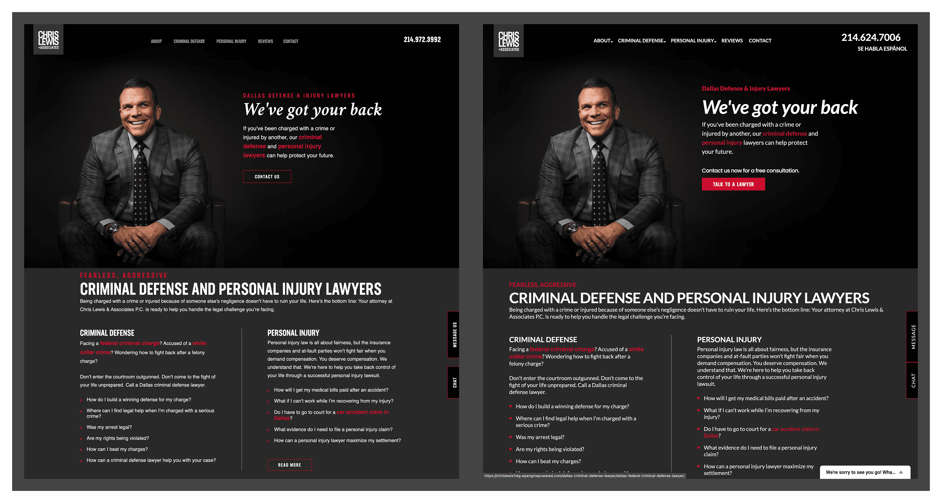
Despite ranking #1 on Google, the website suffered from a high bounce rate (85%) and critically low conversion rates. Data showed users left within 19 seconds, failing to reach the crucial Contact page. My initial hunch was that poor design choices created a confusing and inaccessible experience, driving potential clients away.
The Solution
I conducted a comprehensive UX audit to pinpoint the root causes of the low engagement and conversions. The audit revealed significant design flaws, including issues with typography, color accessibility, and confusing navigation. The solution involved targeted design enhancements focused on improving readability, accessibility, and user flow to guide visitors more effectively towards conversion points.
My Role & Process
My process involved a data-driven approach combined with a detailed design analysis:
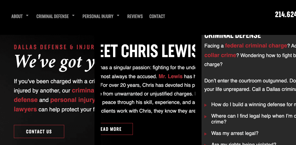
Site Audit & Findings: I conducted a thorough visual audit, identifying poor font sizing, awkward kerning, and the straining effect of inaccessible red accents on a dark background, confirming readability problems. Tools like Colors.review were used to validate color contrast issues.
Data-Driven Insights: I analyzed Google Analytics data, noting the alarmingly low time on site (19 seconds) compared to industry benchmarks (Nielsen Norman Group's 30-second threshold). Path Exploration in GA4 showed users were not navigating to the Contact page, pinpointing a major blocker. Basic SEO analysis also revealed misalignment between search terms and landing page content that hindered user retention.
Key Improvements: Based on the findings, I implemented specific design changes. This included upgrading typography (using Lato, increasing paragraph size to 18px), improving color accessibility (replacing red highlights with bold styling), and enhancing UI elements (enlarging the header menu and phone number, adding button hover states, improving CTA visibility). I also refined page titles and keywords for better SEO alignment.
Outcome & Impact
The implemented design improvements significantly reduced the website's bounce rate. Users stayed on the site longer and successfully navigated to the Contact page, resulting in a measurable increase in conversion rates (form submissions and phone calls). The site was transformed from a high-bounce platform into a more user-friendly and effective conversion tool.
Key Takeaways
This project reinforced the critical link between fundamental visual design, accessibility, and conversion rates. It highlighted how poor usability can completely negate strong SEO performance. The project demonstrated the power of combining quantitative data (Analytics) with qualitative analysis (UX audit) to diagnose problems and the direct impact of targeted design changes on key business metrics like bounce rate and conversions.

Key Features Implemented (Design Improvements)
Enhanced Typography (Lato font, increased 18px paragraph size, improved kerning)
Improved Color Accessibility (Replaced red highlights with bold styling)
Enlarged Header Menu and Phone Number
Added Button Hover States
Improved Call-to-Action Visibility
Refined Page Titles and Keywords (SEO Optimization)
Deliverables
Comprehensive UX Audit Findings Report
Recommendations for Design & Accessibility Improvements
Implemented Design Changes on the Live Website
Collaboration
Worked as part of the team managing the client's website. Collaboration would have involved presenting findings and proposed changes to stakeholders (likely client or internal team) for approval and potentially working with a developer to implement changes if not done directly.
Challenges Faced
A primary challenge was overcoming the existing poor design and accessibility issues that were actively driving users away despite strong search rankings. Effectively communicating the impact of seemingly minor design flaws (like small, unreadable text or inaccessible colors) on crucial business outcomes (conversions) was also key.
Measuring Success
Success was directly measured by the significant reduction in bounce rate and the increase in conversion rates (form submissions and phone calls) following the implementation of the design and accessibility improvements. Increased time on site and successful navigation to the Contact page were also key indicators of improved user engagement.
Note
Specific percentage increases for bounce rate reduction and conversion rate increase were not available for this case study.